|
Since 34SP limits how big of a file I can upload - for convenience this time, I have uploaded this .zip file into the Google Drive folder of assets for the project:
https://drive.google.com/drive/folders/1yAk4NYULTGPnzh5pZqct-WpS7i_V2Y4L
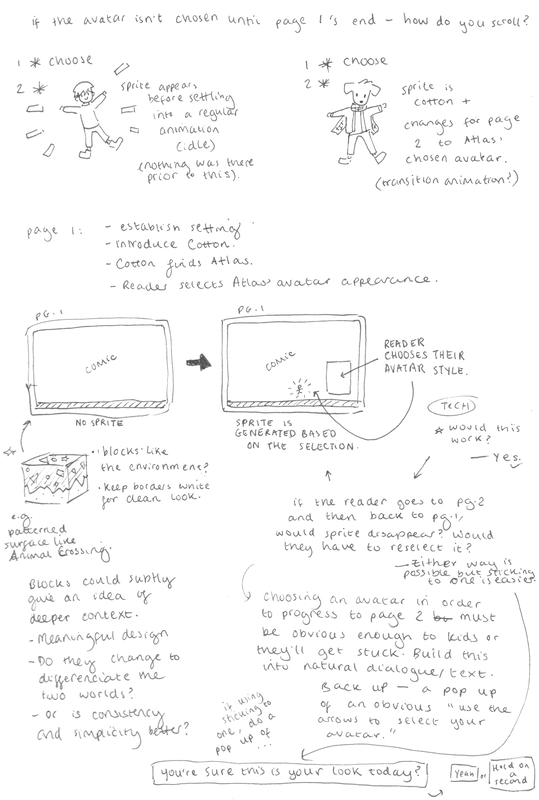
Although the process of designing pages in my sketchbook was providing interesting results, the process felt very slow due to so much consideration with panel placements. I felt the process may benefit from digital sketching since moving panels around is much more accessible. Saving screenshots regularly and being experimental is still very important.
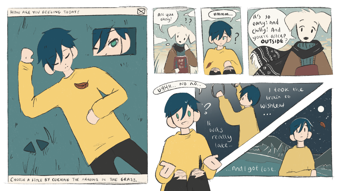
I have also been struggling with pacing when illustrating the story, so being able to more freely redraw panels and dialogue is very helpful for overcoming problems. On Page 3, I had too much I needed to condense into the page, and Page 2 had somewhat wasted space. I redrew Page 2 as my experiement into sketching with the iPad. The great thing is that my images are ready to be cleaned up and coloured immediately, as I can sketch on a 3840 x 2160 pixels canvas at 300dpi from the get-go. The first step of the process was to make sure my images are the correct resolution and size. Logan then had to scale the grid of the game engine to fit the canvas. Even though computers only view 72dpi, I am designing at a resolution of 300dpi, incase I need high resolution images to print for my portfolio later down the line. I cropped my scanned sketch of page 1 to the correct size: Logan had to experiment to find a scale that worked. On getting the scaling right, we realised that the original resolution of 1280 x 720 pixels was far smaller than expected, being only triple the size of the very small sprite. We experimented with how we could scale up the size of the image and have it be of a correct relative to the sprite size. I chose the x3 scale image size, for it would be less likely that the sprite would interfere with text/visual elements. To help with this further - we implimented a jump animation for the sprite, and Logan imported a stock sprite onto the page as it would sit in the final version, to be able to preview how this would work. You can see from the image below how this is very important. Above is the same preview, but on the x2 scale of the image. Using the x3 was definitely the better choice. This new resolution meant that all future images should be 3840 x 2160 pixels, at 300dpi. Logan was able to perfectly align the edge of the image with a 'floor' for the sprite. The 'floor' and 'walls' (vertical strips) will just appear as borders - but are necessary to make the page turning mechanic work. As the character hits the right, partially invisible 'wall', the character will move into the next 'room' - like a game. The next 'room' is the next page of the comic. Above is the final scale of the 'room' which functions in harmony with the size of the image and the sprite. Logan adjusted the camera to make the artwork central. This created black bars on the sides, but these can be changed to any colour. The decision of what to do with this will come when the comic has colour. The next things to be implimented were the jump, the avatar system and the music (sound effects were added early on). I trimmed and added fade effects to some suitable tracks (previously metioned in a #Sound blog post) so that they wouldn't sound so harsh as they loop during reading. I used Premiere Pro to do this.
Between Dreiton (by C418), Hidden Structure (by Leavv) and Lighthouse (by Leavv), I am unsure which to use. I will decide by listening to them while immersing myself in the comic when the prototype is completed. It is then that I can decide which one supports the intended atmosphere and matches the pacing of the events in the story the most. I also learnt how to make a a track muffled (for example, sounding underwater) - for potential use on selective pages or menus. I used a tutorial and Premiere Pro. Logan also informed me, regarding the buttons for switching avatars, that each button will need to be a .png of it's own and not within a larger image. This is simple going forward, as the buttons just need to be designed in their own layer, exported as a .png, and trimmed down to be without the entire canvas size. This applies for any interactive elements. (Above) The movement feature of jumping has been implimented and feels very light, in line with the comic's atmosphere. (Above) The avatar selection mechaninic through interacting with an element on the image is now active. This test sample uses pre-made sprites (one being Kirby.) When I come to animating my own pixel sprites, I have to export the frames as single images and make them into a 'sprite sheet'. This website will be useful for creating a sprite sheet: https://ezgif.com/gif-to-sprite. (Above) Logan also implimented a preview pane for the avatar selection. This can be moved anywhere and turned on or off. Using this feature will depend on the final layout of page 2, but I don't think it is particularly necessary in this project. If it adds visual impact I may find a way to use it. (Above) A definite test video of all of the implimented features so far: sprite running and jumping, avatar selection buttons, rooms, a platform, music, sound effects, and the artwork in the background. Additional Notes From This Process |
Pixel PlastersDevelopment compilation for Pixel Plasters. Archives
May 2022
Categories
All
|
|||||||||||||||||||||


