|
Extra project work made for the ILLU6030 resubmission brief. Line and Texture Experiments (New) Development Work for Pages: Concepts, Arrangements and Panels The last image in each slideshow is the original outcome of each page. Pixel Art World Exploration Inserting Atlas into pixel art environments made by other artists. This is to explore how the video game world could have looked different, and how effective this might have been when combined with Atlas' design and art style. I think the combination of the flat-colour illustration and the pixel backgrounds is really dynamic. It communicates that Atlas is somewhere foreign and different to themself and their origins. The pixel art is a key indicator that they are inside a game, even without the context of the plot. This is due to video games' origins coming from pixel art. It is definitely more visually interesting than environments drawn in the same way as the character, in this case, as it does more to enhance the story's context. Character Design Experiments Below are some examples of kids in media that I looked at while thinking about character design.
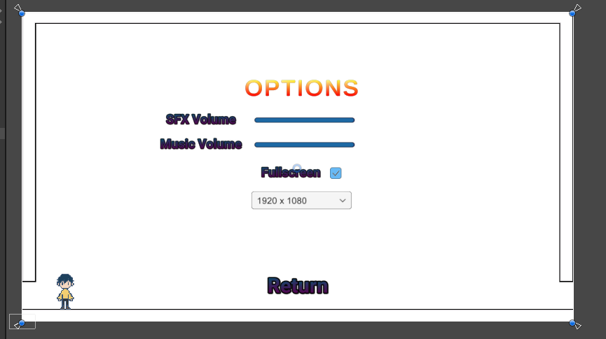
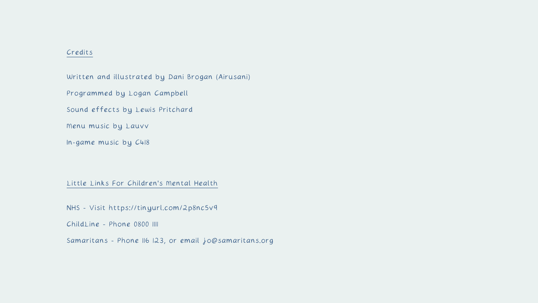
MenuThis illustration is based on a menu sketch from earlier in development. In the real world on the protagonist's blanket, their games console with Pixel Plasters running doubles as a menu screen. This suggests that you are about to go into this game in both the game world and the real world. References on the blanket are to life-simulation games that are known to help with mental health - while also being items that are (most) likely to be in a child of this age's bedroom. There is also a plush doll of secondary character Elio - who the protagonist meets later on in the story. This is a fun little implication that the protagonist became a fan of this game and bought this. Page 1The first page is focused on setting the scene. It is daybreak to symbolise the beginning of new things, and the fall of darkness; the world is calm and serene. I designed the panels in this very slow and steady manner to emphasise this. The panel progression also builds up to the last one, which reveals all of Cotton for the first time. As the first face we meet in the comic, this was important to make interesitng. I also drew him facing left when noticing something afar so physically he is guiding the reader to turn the page and find out what it is. The extended panel at the bottom is to take advantage of the comic format to show two moments in the same. It also provides a continuation of the prolonged moment in the opening page for the audience to understand what kind of place this is. Page 2Page 2 is the one that has the character switching button. It's the first illustration of Atlas, so it was important to have this artwork significantly larger than the other things happening on the page. The pacing on this page very steady and this is likely due to the conversation being very slow and not overly informational. I decided to spit the last panel into 3 seperate pieces, but not in a way that would mirror the top row. Having two halves of a triangle, and another panel with Atlas breaking the sense of boundarys, gives the visual impression that they are talking about a flashback. The two triangles making a whole panel help to make this clear - as well as the darkness indicating a different time of day. I broke the fourth wall in writing button instructions on Atlas' introduction panel, but I don't believe that it negatively affects the flow of reading. The buttons could very easily go unnoticed without including this text. I drew a cosmetic X button to give the impression that this window panel was a little bit different to the normal ones. Page 3Cotten helps Atlas up - in a sense of helping them to reach a better place, and this is the beginning of that. The rising sun also symbolises this newfound positivity and warmth. I tried to guide the reader's eye with the arrangement of the middle panels leading upwards to the final column. It is also to lightly convey the idea of the protagonist being pulled up with the panels themselves. I found trying to make a composition using Atlas themself between these panels was difficult to do, but leaves worked really well, and their simplicity compliments the busier illustration of the village that follows shortly. They show a progression of time and it makes sense that they can naturally move in this direction. It also connects to the next page, which also uses these leaves. In this page the leaves are helping Atlas reach a better place, but in the next page the breeze and leaves make them cold as they are slightly afraid of changing things. They are not only a symbol of passing time but in particular the moving journey of Atlas; Atlas' time. Page 4Cotton continues the warmth theme - giving his scarf to Atlas. Despite this love from a new person, I knew that I wished to convey the idea of Atlas being wrapped up in their feelings, and feeling suffocated by their flaws and emotions. They feel too lost to see what's right in front of them - but this is the first shift in facing these negativites head on. The page feels very cold in tone to represent this too. When considering the composition, I knew Cotton's warmth had to be the focus of the page. After this ,the location changes slightly, but instead of drawing walking, it was more important to visualise the conversation and emotions happening during this time. I think this allowed the pacing to feel like a little bit of time had passed since reaching the final panel, despite not many panels being in between. The small illustration of the general store depicts the place as very well kept and within a natural environment - somewhere that would be typically ideal for general mental healing. I guided the stone path out to the corner to lead the eye towards the next page. Page 5This page was very tricky to compose as it had a lot of information to share, a new character appearance and new character dynamics all on the same spread. I couldn't really spread this out to more pages in the time frame, so it took a lot of experimentation to make it work. I was finding difficulty in making the panels read in the right direction, and I continuously asked peers how they naturally read the comic - so that I could get a realistic taste of it's perception. I really like how it turned out but it took a lot of figuring out. For a page with a lot of things happening, it no longer looks too busy at all as it is very balanced out. I also had to spare a banter exchange between Elio and Cotton for the sake of guiding the reader in the right direction, but the latter is definitely the more important thing for the page. Page 6Elio takes Atlas out on their first delivery. I wanted to use less panels on this page so that the pace would slow down a little. I also intended for the panels to be less busy, for a contrast to the page that came before. This part of Atlas' journey is a slow and mindful one, where they are taking in their surroundings and beginning to adjust to change. I think the primary colours on this page work really well together in conveying a positive and bright mood - that of being offered a place to stay, having purpose, but also that of a place that Atlas recognises as beautiful and serene. I chose the pair to offer a delivery service instead of gardening (like in the original concept) after being inspired by the animation Violet Evergarden - a series that focuses on writing and delivering letters - making sure everyone receives the messages they need to hear. It was very much entwined on my mind how much this relates to the purpose of this comic and all the people that should be delievered its message. It was a very emotional series with a protagonist that suffered with mental health herself too from being a child-soldier. So while Elio and Atlas deliver goods, they are also delivering a message to the audience. It is also a common quest in video games to deliver things to others. In Stardew Valley, a mindful game in the research part of the project, you can accept such requests from the general shop's notice board. Similarly, in Animal Crossing, when starting at the town in many of the games, the general shop's owner will ask you to deliver products to town folk in an attempt to lightly push the player to make connections and learn about their new home. This is very closely linked to the ideas in the comic. The bedroom in the comic is also a reference to life simulation game Animal Crossing. Traditionally in the games you would always start out renting a house or a room from a Tanooki landlord - and the situation of the protagonist's whereabouts is a light parody of this in general. This one tiny room would come with only 4 items, always being a bed, a music player, a lamp of some kind, and a cardboard box. It's very fun to draw in references like this that still feel natural to the story. Page 7For this page of the comic, I was striving to depict Atlas as melancholic, so the tones of the page are very pale and dim. I also illustrated a plant losing a waterdrop to create an illusion of a tear droplet splash for that comic panel. Elio's positivity is divided by a cloud, as if to say this optimism is something Atlas dreams of having, but at this moment cannot obtain. The space around Elio is also suggesting the vastness of these "wonderful places." They may be far away, but who knows how many are out there? You'll only know by looking up, which Elio does in the last panel. I also shuffled the speech bubble placements to give a subconcious path of stepping stones which reach out into the bottom corner/next page turn, directing the eye. The cloud is also subtle foreshadowing of the next page containing a memory. Page 8This spread is half set in the real world, in a series of flashbacks projected by Atlas. The other half resumes the active happenings. I thought it was definitely important to contextualise the setting. This scene makes the reader aware that this is infact set in a video game for the most part - and it also gives a window to why Atlas feels the way they do. In composition, I wanted to seperate the sides for clarity. It is already considerably difficult to design horizontal spreads that read in a linear manner, so I decided to keep them apart. I used dark colours on the flashback half to reflect the emotions of the protagonist. I really like how the contrast came out, but I would improve on this page by experimenting with layouts even more so that I don't have to manually draw a line to help with clear reading. I added stars to the background of the flashback to relate to Atlas' darkness but also the light that comes from finding this gift. Celestial/space themes also push a narrative of these two worlds being far apart, but connected. Page 9This page is a small timeskip to future Atlas adapting to life in Wishleaf village and learning how to take care of themselves mentally. This self care is presented in polariods as to coinside with making good memories that will last forever. Polaroids themselves are similar as a frame to regular comic panels too, so I wished to take advantage of this. The page's composition is quite chaotic, and I would probably experiment with this layout more if I had more time. But the intent is that this is Atlas' wall/desk/etc. and it's a physical representation of all the things running through their mind and life. While the speech can be interpreted as being from Elio's customer, it also mirrors the way future Atlas feels. Page 10The newfound hope in the game is carrying out into the real world and affecting real-world Atlas. This is the meaning behind in-game Atlas emerging out of the screen and looking directly at the player. This world is real to them, and it's making them feel better in real life too. The line between their universes is mentally blurred. They are also in control of their own world, holding it gently in their hands and feeling the comfort of permanent warmth. As annotated on the original script too, the high smaller pannel on this page is to mirror page 2, the position in which Atlas is first seen. The illustration is flipped upside down, as is his expression - to show that the way Atlas feels has changed. It also connects their game-world and real-world selves in the same way the the key illustration on this page communicates this too. SystemThe original options screen was very bright and off-theme for the project's aesthetic, so I requested that the design could be minimalised. It was best to keep it looking calm and simple, and you can see that just by comparing menus. I also asked the programmer to download my custom font (.ttf) file so that the text could be uniform throughout the comic. For the credits page, I designed a simple image in Photoshop using the same colour theme and the text tool with my font. I considered adding illustrations to this screen, but I didn't want to make it too busy. Above is a preview of the final menu illustration being functional. I had to export all text as seperate buttons for this to work, and I sent Logan a template so placement on his end would be easier. ExtrasA last-thought touch that the programmer and I thought about for the project was creating a custom icon for the .exe program. While I could have designed something for this, I think a cropped version of Atlas' pixel self was the most perfect thing I could have used for this. It is still clear even when small, for that was it's intended size, and up close it is still visually interesting. Although this is a small thing that I have added, it adds a lot of professional flair to the game.
I had been concerned about not knowing if the message of the story (and project) communicates clearly enough through the medium, artwork and dialogue. Upon my programmer reading the comic for the first time just recently, I asked him what he thought the meaning behind the comic was:
"The real world is ever changing, hard to control, and at times pretty rough. In a game world, it can give you something to latch onto, a place you can be yourself, keep things the way you want it, and have a bit of healthy escapism." This is the narrative route I was going for and I'm pleased to see it reached someone in the intended manner, even if he is not my target audience. He also pointed out some pacing issues with the writing - and this I'm aware of. It is due to compressing the story to not extend past 10 pages. We agreed that an extra page towards the end would have been good for this and I will consider developing this at a later date, even after the deadline. However, since it is not something that affects the overall narrative, it was not a priority to me to change this. It wouldn't have been hard to slot in, but it would have been hard to find extra time to design another page and finish it. I should have asked for peers to read my comic earlier on in the process, and I will do this in the future. In doing the Pixel Plasters project, I learnt about myself how passionate I am about pixel art. I wish to progress with this medium more outside of the project and get better at animating it too. It is also my first time doing anything related to game development and I felt really optimistic and challenged about creating my own little hybrid of illustration and video games. Games are something I care a lot about, so I feel fortunate to have been able to explore this concept freely due to having written our own briefs. I think it was the perfect medium for the project and the audience. I also learnt about myself that I really struggle working from home. Not seeing anyone for a long period of time and not having my peers around me definitely made my progress slower. I am already a slow person when it comes to working because I get absorbed in making things as perfect as they can be - but this was especially true this time around. If I could have done the same project again but in the studio environment, I am certain it would have turned out better than it has. It completes my vision and matches the brief, but I believe it had more potential than I gave myself time to explore. I should have started on the final page designs earlier than I did, because drawing those, cleaning up those, and colouring those took a really, really long time - and it took away from other things I wanted to experiment with after that. Things such as textures, game features and more animation. This was also my first time writing a story - and for a project on limited time this probably was not a good decision. While the experience is good for me as I want to proceed into storyboarding as a professional (and this is closely linked to writing), it definitely set me back at the beginning because I was unsure of the process and when I should move on from it. It was hard to tell if my message would reach the audience until I had it in drawings. I think my writing should have been clearer and then starting to produce illustrations wouldn't have felt so daunting. My decision to write was largely due to having something I really wanted to say, and having this topic be so close to my heart - as I have been struggling with mental health in the last two years, and I also have a very young sibling going through it too. I knew we were not alone in this, especially as the pandemic came, so I was determined to communicate a way for people to help their own mental health using a medium that works for a lot of people. This is also why I was so extensive about the research - mental health is a very serious topic, and I didn't want to imply anything that may be untrue or misleading. Getting a part time job during the project was also very bad for progression because I was so often exhausted, but I was in a tough financial spot and I had to do something about it. I also got rejected from multiple jobs so my confidence and morale was dejected. Hopefully this was too early in the project's development to make itself aware in my work - but even if it did, the protagonist starts out with a similar feeling of being lost and a little sad. But with this said, I learnt that it's worth it to keep trying. This will likely apply itself to future job hunting and I must not let myself become defeated by failure or rejections. I eventually had the confidence to take responsibility and ask for less hours, and feel that my project was more managable - but I definitely did this too late down the line and I should have stood up for what's important much sooner. There was additionally physical illness a total of three times over the course of the project, but these situations can't really be helped. Self care for your body is just as important as for your mind and unfortunately I lost a lot of time to having to recover. The most important thing I've learnt is that you can't always get everything right. As a perfectionist by nature that always tries to do everything as the best as possible in unrealistic times, this was a hard pill to swallow. Even if you try really hard, sometimes you have to be okay with knowing that you did your best with a project. There will always be a thought of "I could have done this and that" to logically help a situation, but often it's the case that at the time of trouble you're doing your best in that moment, and that it was a struggle that you still managed to get through. I am proud that I have not given up on this project after the hardships that I have been through and I look forward to polishing it even after the deadline so I can show it to young people and fulfil its purpose. My biggest problem with this project was that while the medium of an interactive comic game was perfect for what I wanted to communicate, it was also something I had never tried before. I didn't know how long things would take, and I failed to pace myself in a way that I had spare time at the end to try to improve the way it went. Despite this, I love the depth of this medium. A game about how games can help your mental health - while it's already innovative on the surface, it's directly supporting the narrative, appealing to the audience, and is what I need for my portfolio. Due to a game for desktop having to be landscape, this meant that my pages had to be designed in landscape too. Comics are traditionally portrait and I did not find much inspiration for page design in this format. Children's picture books often come in landscape, but comics are slightly more difficult because you have to make sure to arrange panels in a way that the page reads the right way. This combined with making every page different in composition and pushing the narrative was really challenging and I would not recommend doing this over the portrait format. I do think the pages turned out interesting in layout, but I think I could have done more had it not been landscape. Also, because of the huge size of the pages and using many different types of comic panels, I found it was easier to design digitally. This is very different from my usual process of drawing thumbnails in a sketchbook, and it isn't my ideal way to design. But designing digitally gave me much more freedom for moving panels around and changing sizes rather than drawing so much over and over again until something works. So while I would rather design like I usually do, I didn't find it problematic to experiment digitally. Analogue methods may have produced meaningful and unexpected results but in the same way the digital sketches worked in a similar way for me. I tried to take screenshots to record the process, and going into each page I knew what I needed to say. I would also liked to have experimented with textures, using pixel art within the colour design, and adding idle animations to the sprites. These things sound very fun to me and it is a shame to not have had a chance to play with these aspects. I will do so, but it will be after the intended deadline. Importantly, the essentials are finished so it is on the most part professionally ready. I also didn't have much time to put in the character switching mechanic that we had developed since the pages were not cleaned up until very late in the project. These processes would have been enjoyable if I had started them earlier and not felt a need to rush them. I believe overall the project works. I think the colour palette communicates the gentle aesthetic I was going for - although at times I wonder if it was too pale or dull for a chidlren's comic, children are also often into pastel things and I don't think the pages are boring to look at. The design of the characters is something that I know works for this audience, and I tried to keep the comic dialogue clear for this reading age. While I wish I could have added details and experimented with shading, there is a consistency for the most part with the game that makes it feel whole, complete and intentional. And it is intentional that I wished to use flat colour, since I was inspired by how well my last flat colour comic piece came out. Creating my own font was very good for the process because if I thought about changing dialogue to make it clearer for the audience, this was an easy thing to do since it did not have to be hand-written. It also looked really clean and not too unlike my usual handwriting. I used only 14pt and 16pt sizes so there would be a consistency but I wonder if I could have used text in more experimental ways throughout the comic. Text placement was very considered and I tried to place it not as an afterthought - but having the bubbles be considered as a part of the illustration. This meant that the speech never looked out of place, and was easy to read and follow. I think the music really adds an atmosphere to the reading experience, and the pixel sprite doesn't distract you from the pages. It adds charm and the sprite art in general came out better than I was expecting. As mentioned before, I would have liked to draw more animations for it - like sitting down when left idle - or changing in some way in accordance to the progress of the story, but with the time restraints of the project it just wasn't possible. Again, I may still do this, it is most important that the fundamental animation was completed. The lines being drawn in a 6B pencil definitely work well in communicating the soft and slight imperfection that I needed - but in using this I couldn't use fill tools on Procreate because this brush has pixels missing. I may make my own brush in the future that has a similar effect but is compatible with the fill tool - this would save a lot of time. It was not the most efficient to paint everything individually as if it was traditional, but the success of the brush made this feel worth it. The message of the story comes across as intended, and as a whole project I believe it does what it set out to achieve. My illustration development from here on will continue in the form of making more pixel art, comics and animations. I am going to try to teach myself modern animation programs so that I have software experience for jobs - the things like Toon Boom Harmony. This may be expensive and thus take some time to do, but it will be worth it. Alongside this, I must study the principles of animation for that is what I have missed out on by not doing an animation degree. I already know the foundations of how it works - and what you need to do to make a great animation - but I'm very serious about improving my knowledge and then putting that into practise. I could have animated in this project more, but I didn't leave myself enough time due to the drawing process taking longer than I expected. Having illustration skills is arguably the most important thing as you cannot fully reach the potential of dynamic storyboards and interesting compositions without having these skills. I am also interested in games development because of this project. Working as a team to make things functional and come alive was really interesting and fun. Illustrated and animated assests are incredibly important to any game and I'd like to collaborate with some of my programming/coding friends, and creative professionals, to create more things, and communicate more important messages. I would also like to draw more often for myself. The last year or two have been quite hard on me personally, but I'm going to make a lot of effort this year to reignite the passion I had for drawing every day back in college and first year of university. I think being away from the university's creative environment and the pressure and circumstances of third year really took this away from me, and I'm determined to find it again. I would also like to make myself more present on social media for inactivity is not optimal for growth. I haven't been posting much since I have just been focused on my work and been busy with my job, but now I will have the freedom of time to make the most of social media that I can. My intention is to build a portfolio on my feeds that shows employers that I can consistently create good work. I can start by sharing this project, and for future projects I would like to post while they are in progress rather than waiting until they are finished. The next step in developing my practise is to do more 2D animation and illustration, continue making connections in the creative industry through social media, and then creating more of my own storyboards and pieces of sequential art. The Pixel Plasters project will be very helpful for my portfolio, but I definitely also need more of it. The interesting thing is that in creating this project, I have also in turn created a template for comic-games that I can re-use in future personal projects should I want to. While this still includes a programmer being needed, if I ever wanted to make another interactive comic for a personal project, I already have a huge part of the process done, and I would also know what to expect. The plan there-after is to follow the research I conducted in our Professional Practise module and to apply for storyboarding internships. These are hard to come by, so I will also be looking out for general preproduction for animation roles. This project has also sparked a serious interest in game design too, so I will also be looking at opportunities for creating illustration and animation for video games. Often times though, if you work for an animation studio, a brief for a video game may be part of the job anyway. I'm very excited about getting into the industry, helping a studio to tell a story and starting to reach a place where I can make my mark.
The image switching mechanic is now tied to selecting a character. The character you select on page 2 changes the image on page 2 and beyond that. A look at the first Atlas sprite when imported into the program. It works as intended! I did notice that the sprite was floating slightly above the baseline of the frame, and directed the programmer to edit this. Here, Atlas' first and second avatar versions are imported into the program. They are functional and feel very consistent. I made the decision after viewing this to remove the preview pane for sprite selection. It slightly interferes with the key illustration, and the character selection is clear enough without it.
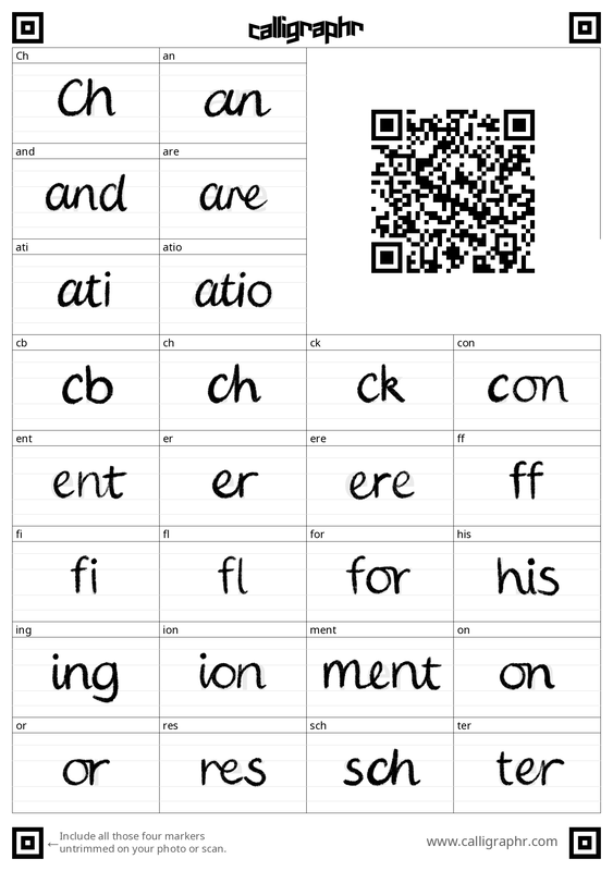
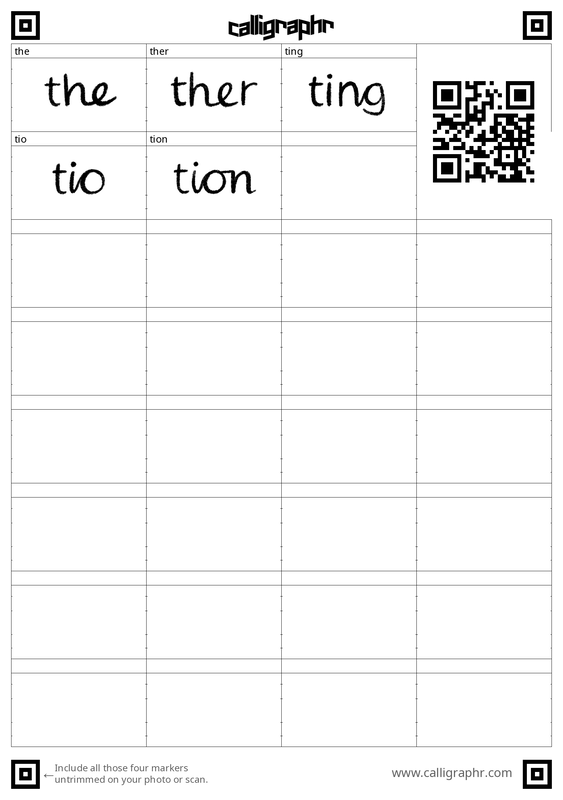
As mentioned in a talk-through recording, upon drawing the comic's roughs I realised that handwriting the text was definitely what I wanted to do, since it is gentle in quality, but also that over a span of many pages, it would be hard to keep the handwriting consistent in size and character. Thus, I looked for a way to create my own font. I still wanted to handwrite it. It would be imperfect as to keep the original quality, but surely more professional in appearance than if there was no font at all. Using a font also saves time in the respect that I can experiment more with editing dialogue, rather than having to go back and handwrite on the image again. Generally, it is also faster and cleaner. I followed a tutorial on how to use Procreate (my illustration medium of choice) and an app called Calligraphr to create a font. It offers a downloadable template, with which you draw over the faint letters in your own handwriting, and then upload the templates onto Calligraphr, choose some settings - and there you have a font of your own to download and install. After uploading the templates, the previews for each character made me realise that the application did not respond well for dainty lines with small details. This caused my pencil crayon brush to appear sharp on the edges rather than soft. In big sizes this is problematic, but in smaller sizes this goes unnoticed, and the handwriting does not look harsh or sharp in that manner. I believe this to be fine for this comic since the text will never be a very big font size, but for future note I would not use this brush again. I used this brush for it is the same brush I used for illustrating the line art of my comic pages, and I wished for these to be the same. (Above) The details picked up by the application compared to the real quality of my lines. (Above) The text's appearance in medium and smaller sizes. It's pleasantly very much legible in both. However, I did tweek the kerning so that the characters would be closer together, and this indefinitely made the font feel more unified. I also removed the cursive ligatures because while they are natural to my handwriting, they negatively impacted the flow and overall appearance of the font. The baseline and size of the 'a' was also noticebly different to the other characters, so I adjusted this too.
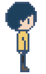
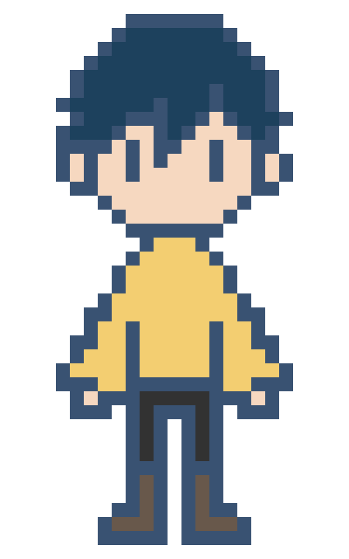
Left and right walk cycles for Atlas only needed to be 4 frames long each. The idle pose is acceptable as stationary, but having it move even just a little would make it feel more alive. Of course I still have to edit this sprite for the different skin colours and hairstyles - but this is a simple process when it is only a 4 frame animation. The walk cycle at 4 frames per second (FPS) compared to 8FPS is much more natural and fitting. Using 8FPS for a 4 frame animation looks like excessive speedwalking. I took the time to modify Atlas' hair on the left facing sprite to better match the character's left side profile. This extra detail also makes it less apparent to the audience that it is a horizontal flip. To turn the sprite frames into a sprite sheet, I can use an online resource that automates this process: https://ezgif.com/gif-to-sprite. This makes the process fast and easy, and accessible for the programmer. (Above) 2 frame classic bounce animation for being idle. Very easy to do but indefinitely gives the sprite more life. Avatar 2Since the design of Atlas both in comic and in sprite only change by hairstyle and skin colour - for the sake of simplicity in this project's production time - it was very straight forward to be able to use the first sprite as a template. In the original designs, the clothing and the front of the hair was the same, just to help maintain a consistency with the main character's identity. The original design for the second avatar was for it to be slightly more feminine, a mid skin tone, and to have a ponytail to the side. However, I decided to go more for a down version of the hairstyle for two reasons. Firstly, I realised that the ponytail was a little close to extending off of the canvas. While it is easy to make a canvas larger, it complicates the enlargement process. The sprite may have ended up the wrong size, and it was not worth the complications. If I was to draw these sprites from the beginning again, I would have used a canvas with more spare pixels around the initial design, so that experimenting and design isn't limited by space, and later complications can be avoided. Secondly, it isn't a common hairstyle for this age group of young girls, and they are more likely to simply wear their hair down. Avatar 3Avatar 3's description was to be darker in skin and have mid length hair, proposing more of an androgynous appearance. Sprite SheetsEarly pixel art trials of Atlas (before their final design had been decided) were very much experimenting with colour, line and the amount of pixels used for the character sprite. The first is very visually unappealing. There were not enough pixels for the face to have charm, and the face length was too pointy. Additionally, not having much definition for the outlines was not effective. The second experiment worked much better. Although there is a similar amount of pixels, the black lines really help the sprite to pop. The minimal detail (no mouth, big pixels) also works in communicating a very classic video game feel. It is only problematic in that with no room for eyebrows or a mouth, it is harder for any facial emotion to be present. While a sprite can communicate emotions through body language, it's still something I should consider. It should also be noted however that this sprite will be considerably small and details like this would probably not be possible to create successfully regardless. While I'm unsure if this is better for the purpose that it is to serve, the third version of Atlas definitely captures the spirit of the character the most. I'm unsure if it may be too detailed (too many pixels) for a very small sprite, but this also allows for more expression. If it is small, will it need such levels of expression, though? For the process of creating the final version of the Atlas sprite, I bought the popular (one time payment) pixel art application Aseprite and did some test versions to get a hang of the controls. However, with some experimenting I understood that I still prefer what I can achieve with Photoshop, and at this time at least, it is more efficient to use a program I already know how to use very well. This was another attempt at creating the final Atlas sprite. I worked in Photoshop this time, and it was definitely much faster and I was able to easily also use the official palette from the comic. I learnt that the black lines may be a little bit harsh, but an overlay filter on the lineart proved effective at softening the design while still having it be distinctive. I also had the idea of using noise to create a glitch transition when the sprite is generated into the game, but I'm going to leave experimenting with this animation concept until priorities are completed. This design was also the most adept at communicating a variety of facial expressions: While I think this sprite turned out really well, and would work for pixel illustration generally, when reduced back to it's original, smaller size, I realised it might be better to use a 'chibi' style design, more like some of the smaller sprites looked at in my research. As a stand alone, it would be acceptable, but considering I have to animate this sprite, and also alter its design for different character choices, it would be sensible to simplify the design. Here, I redesigned the previous sprite to be much more minimal. I have definitely been influenced the most by Omori's sprites and Pokemon's map version of sprites, as I felt that this stylisation is the most appealing for young children, since it is 'cute'. Drawing like this also allows for the sprite to really take Atlas' characteristics, while also being alike to my usual illustration 'style'. The blue tinted lineart is definitely still less harsh than the pure black and I will be using this going forward for the other frames of the sprite animation. The original size of the sprite image (25 pixels wide) is too small for its intended purpose. To upscale this sprite with accuracy, I compared possible sizes with the final dimensions of the comic illustration pages. The original sprite was created on a canvas only 25 pixels wide, but even upscaling to 100 pixels wide was extremely small. 200 pixels is a suitable size, but it aligned awkwardly with the borders of the comic. 180 pixels works out just right. This sizing is easily adjusted though, and may be revised later on when compared directly to the final images.
|
Pixel PlastersDevelopment compilation for Pixel Plasters. Archives
May 2022
Categories
All
|
||||||||

