|
I had been concerned about not knowing if the message of the story (and project) communicates clearly enough through the medium, artwork and dialogue. Upon my programmer reading the comic for the first time just recently, I asked him what he thought the meaning behind the comic was:
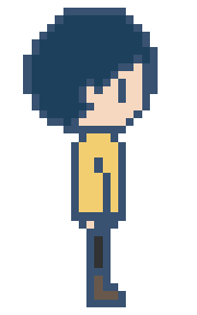
"The real world is ever changing, hard to control, and at times pretty rough. In a game world, it can give you something to latch onto, a place you can be yourself, keep things the way you want it, and have a bit of healthy escapism." This is the narrative route I was going for and I'm pleased to see it reached someone in the intended manner, even if he is not my target audience. He also pointed out some pacing issues with the writing - and this I'm aware of. It is due to compressing the story to not extend past 10 pages. We agreed that an extra page towards the end would have been good for this and I will consider developing this at a later date, even after the deadline. However, since it is not something that affects the overall narrative, it was not a priority to me to change this. It wouldn't have been hard to slot in, but it would have been hard to find extra time to design another page and finish it. I should have asked for peers to read my comic earlier on in the process, and I will do this in the future. Left and right walk cycles for Atlas only needed to be 4 frames long each. The idle pose is acceptable as stationary, but having it move even just a little would make it feel more alive. Of course I still have to edit this sprite for the different skin colours and hairstyles - but this is a simple process when it is only a 4 frame animation. The walk cycle at 4 frames per second (FPS) compared to 8FPS is much more natural and fitting. Using 8FPS for a 4 frame animation looks like excessive speedwalking. I took the time to modify Atlas' hair on the left facing sprite to better match the character's left side profile. This extra detail also makes it less apparent to the audience that it is a horizontal flip. To turn the sprite frames into a sprite sheet, I can use an online resource that automates this process: https://ezgif.com/gif-to-sprite. This makes the process fast and easy, and accessible for the programmer. (Above) 2 frame classic bounce animation for being idle. Very easy to do but indefinitely gives the sprite more life. Avatar 2Since the design of Atlas both in comic and in sprite only change by hairstyle and skin colour - for the sake of simplicity in this project's production time - it was very straight forward to be able to use the first sprite as a template. In the original designs, the clothing and the front of the hair was the same, just to help maintain a consistency with the main character's identity. The original design for the second avatar was for it to be slightly more feminine, a mid skin tone, and to have a ponytail to the side. However, I decided to go more for a down version of the hairstyle for two reasons. Firstly, I realised that the ponytail was a little close to extending off of the canvas. While it is easy to make a canvas larger, it complicates the enlargement process. The sprite may have ended up the wrong size, and it was not worth the complications. If I was to draw these sprites from the beginning again, I would have used a canvas with more spare pixels around the initial design, so that experimenting and design isn't limited by space, and later complications can be avoided. Secondly, it isn't a common hairstyle for this age group of young girls, and they are more likely to simply wear their hair down. Avatar 3Avatar 3's description was to be darker in skin and have mid length hair, proposing more of an androgynous appearance. Sprite SheetsSince 34SP limits how big of a file I can upload - for convenience this time, I have uploaded this .zip file into the Google Drive folder of assets for the project:
https://drive.google.com/drive/folders/1yAk4NYULTGPnzh5pZqct-WpS7i_V2Y4L
Although the process of designing pages in my sketchbook was providing interesting results, the process felt very slow due to so much consideration with panel placements. I felt the process may benefit from digital sketching since moving panels around is much more accessible. Saving screenshots regularly and being experimental is still very important.
I have also been struggling with pacing when illustrating the story, so being able to more freely redraw panels and dialogue is very helpful for overcoming problems. On Page 3, I had too much I needed to condense into the page, and Page 2 had somewhat wasted space. I redrew Page 2 as my experiement into sketching with the iPad. The great thing is that my images are ready to be cleaned up and coloured immediately, as I can sketch on a 3840 x 2160 pixels canvas at 300dpi from the get-go. The first step of the process was to make sure my images are the correct resolution and size. Logan then had to scale the grid of the game engine to fit the canvas. Even though computers only view 72dpi, I am designing at a resolution of 300dpi, incase I need high resolution images to print for my portfolio later down the line. I cropped my scanned sketch of page 1 to the correct size: Logan had to experiment to find a scale that worked. On getting the scaling right, we realised that the original resolution of 1280 x 720 pixels was far smaller than expected, being only triple the size of the very small sprite. We experimented with how we could scale up the size of the image and have it be of a correct relative to the sprite size. I chose the x3 scale image size, for it would be less likely that the sprite would interfere with text/visual elements. To help with this further - we implimented a jump animation for the sprite, and Logan imported a stock sprite onto the page as it would sit in the final version, to be able to preview how this would work. You can see from the image below how this is very important. Above is the same preview, but on the x2 scale of the image. Using the x3 was definitely the better choice. This new resolution meant that all future images should be 3840 x 2160 pixels, at 300dpi. Logan was able to perfectly align the edge of the image with a 'floor' for the sprite. The 'floor' and 'walls' (vertical strips) will just appear as borders - but are necessary to make the page turning mechanic work. As the character hits the right, partially invisible 'wall', the character will move into the next 'room' - like a game. The next 'room' is the next page of the comic. Above is the final scale of the 'room' which functions in harmony with the size of the image and the sprite. Logan adjusted the camera to make the artwork central. This created black bars on the sides, but these can be changed to any colour. The decision of what to do with this will come when the comic has colour. The next things to be implimented were the jump, the avatar system and the music (sound effects were added early on). I trimmed and added fade effects to some suitable tracks (previously metioned in a #Sound blog post) so that they wouldn't sound so harsh as they loop during reading. I used Premiere Pro to do this.
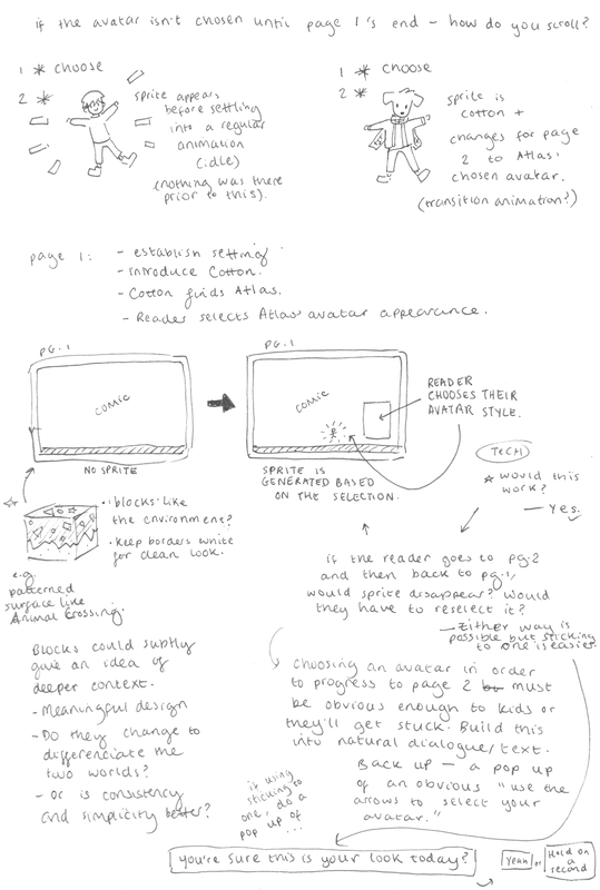
Between Dreiton (by C418), Hidden Structure (by Leavv) and Lighthouse (by Leavv), I am unsure which to use. I will decide by listening to them while immersing myself in the comic when the prototype is completed. It is then that I can decide which one supports the intended atmosphere and matches the pacing of the events in the story the most. I also learnt how to make a a track muffled (for example, sounding underwater) - for potential use on selective pages or menus. I used a tutorial and Premiere Pro. Logan also informed me, regarding the buttons for switching avatars, that each button will need to be a .png of it's own and not within a larger image. This is simple going forward, as the buttons just need to be designed in their own layer, exported as a .png, and trimmed down to be without the entire canvas size. This applies for any interactive elements. (Above) The movement feature of jumping has been implimented and feels very light, in line with the comic's atmosphere. (Above) The avatar selection mechaninic through interacting with an element on the image is now active. This test sample uses pre-made sprites (one being Kirby.) When I come to animating my own pixel sprites, I have to export the frames as single images and make them into a 'sprite sheet'. This website will be useful for creating a sprite sheet: https://ezgif.com/gif-to-sprite. (Above) Logan also implimented a preview pane for the avatar selection. This can be moved anywhere and turned on or off. Using this feature will depend on the final layout of page 2, but I don't think it is particularly necessary in this project. If it adds visual impact I may find a way to use it. (Above) A definite test video of all of the implimented features so far: sprite running and jumping, avatar selection buttons, rooms, a platform, music, sound effects, and the artwork in the background. Additional Notes From This ProcessThis is an illustrated draft script that I have written for the comic's narrative. I drew alongside writing the story to begin to develop a language that is shared between the text and the art in harmony. Some of these sketches may be recycled and reimagined later in visual development. The narrative will be refined in the layout stages. The audience's reading level must be kept in mind during this process, but most of the comic's storytelling should be in the form of "show, don't tell," anyway. I must again remember to refer back to the professional advice from Joe Latham.
Progression of reading the comic with the chosen music track should also be thoroughly considered. The pace of the narrative can affect the reading speed, and therefore how the narrative and music may line up. What is the average speed of reading? Will the artwork and music have the flexibility to always be compatible? Is it possible to use the music to emphasise the narrative? (etc.) There would be potential to sync the music to progress to specific points when a (digital) page is turned in the comic, but this would also be a matter of programming knowledge, and may also require specialist skills in music software. Volume of audio is something that could be toggled instead to release or build emphasis in the story without needing an advanced skill-set. I will make an enquiry with my project programmer about this, and experiment if possible. This is my first time professionally writing a children's story, so I contacted an experienced illustrator who writes and draws comics that appeal to children - Joe Latham. He gave insightful advice. Before I could write a draft and script, I had to make some decisions regarding the storytelling.
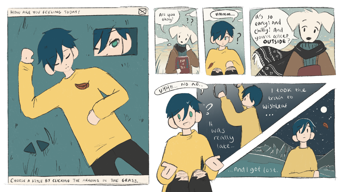
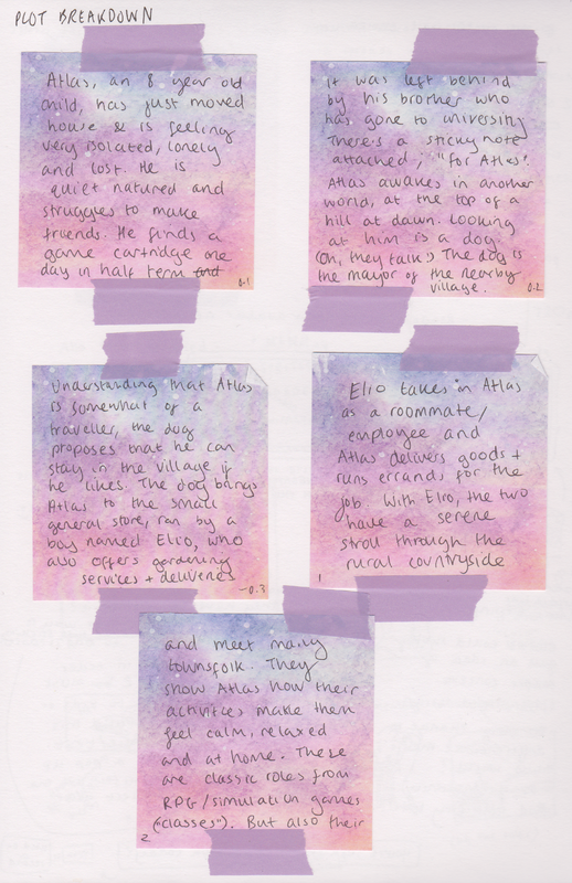
Plot Summary It's a digital comic for children aged 8-11 that'll tell a story that teaches them that video games can be good for your mental health, and they're there for you to use them if you need to. The video game genre in focus is life simulation/RPG games, and the story is more about games that aren't designed to help your mental health but have the ability to help you anyway (as opposed to video games that are designed with a mental health plot.) The mental health issues narrated are loneliness and anxiety but the general message applies to the broader scope of mental health. The comic's plot is of a kid that's just moved away from their hometown, and is starting a new life. They experience said feelings of loneliness and anxiety. While sorting through some moving boxes, the kid finds some keepsakes left behind by their brother who went off to university. He had left them behind for her. A bunch of these keepsakes can be references to life simulation games, but one of the things they find in the box is a Switch game card (I think having a 3DS wouldn't be relatable for modern children.) It's a parody of Animal Crossing, mixed with elements of similar games like Stardew Valley and Minecraft. They play the game and the visual narrative shifts into something that subtly resembles pixel art effects, but not completely. A digital illustration/pixel art hybrid style. The character enters this world where they have just moved to a new place, and the character resonates with this feeling that they're also experiencing in real life. They are taken in by the post office resident as a place to reside until they get some money, and the resident asks them to deliver some parcels to the other villagers. In encountering different people on this journey, the character learns how they are helping their own mental health, through simple things such as fishing and feeling the air, or another looks after their garden and breeds flowers. It's kind of hazy where to go from here. But the general idea is to borrow gimmicks from life sim games. But in the general scheme of things, the character is positively influenced by the characters and learns to appreciate this beautiful new place. They finally feel like they have somewhere they can call home, somewhere safe where they feel like they belong. They come out of the game feeling refreshed and calmer than they were feeling before they played. And as the reader, you would come out of the story feeling equally as warm and positive. Design The colours are blue and yellow. Yellow for its warmth and happiness post-reading the comic/playing video games, and blue for its calmness but also its loneliness and sadness before engaging with such elements. The colours can be used to emphasise the visual storytelling. The brush texture is to have a crayon-like appearance for it is gentle and suitable for the topic. Additional textures will aim to capture a similar approach. The comic is completely digital to allow for interactivity with reference to the medium of video games. It is also suitable for the real-world Covid-19 situation (remote learning, everything is digital.) This also allows the addition of subtle animations that help bring illustration to life. Sequential art is my strength so while it fits the project, it is also what I need for my portfolio as an illustrator going into the animation industry. Programming I will be using interactivity less in the way of emphasising the visuals, but more in the way of enhancing engagement with the reader. The comic has a set number of pages, it is flexible, since it will not be a physical copy and therefore does not have to stay in sets of 4 pages. Page count should be influenced by children’s books/comics for the same age group for a guideline. The reader controls a very small pixel avatar matching the protagonist, using WASD or arrow keys. This is a page turning mechanic. It is a simple device that pushes the message of being in control of your life (your mental health) and is a reference to controls on video games. If the avatar touches the left or right side of the page, the comic’s page will shift in that direction to the one before/after it. At the beginning or end this does not function. I considered game elements such as “Can you win? Can you jump? Can you collect things and interact with the comic itself?” but I don’t believe those elements would assist the storytelling, but more distract from it. I think the navigation interactivity is enough. In evaluating this mechanic, it would have been too much time to learn how to program this myself as it is a complex skill and there is a set deadline. Outsourcing it is the smartest idea. I will still do all the artwork and design, they will just make it function. The comic will be presented in the form of a downloadable .exe file on my website. The comic’s webpage can be presented similarly to a game’s sale page on Steam or Nintendo eShop. Alternatively, I can upload the .exe to itch.io free of charge. Perhaps this is an option for a later date when the project has been fully refined for a public release. Project potential is being able to send the comic to be distributed in primary schools for the relevant age groups. Game Elements I have been considering the use of a game avatar. Having a self-insert is common in life simulation and RPG games, but there are time-management problems that would come from having a customisable protagonist for the story: Should I have a protagonist that would reflect the reader, or a self-inserted avatar? Think of the player customisation in Animal Crossing; the reader of the comic would create their character before reading, and that character becomes the protagonist. Problem: I would have to redraw and reanimate every single comic panel with the character in, according to every single possible combination from the customisation. Solution: Very basic customization, like genders, maybe hair styles, or hair colours. Maximum like 5 options? Problem: People hate gender in games these days, so I'd have to not label them. Obviously male, obviously female, and something in the middle (NB)? Also have to show racial/equal representation. Solution: Skip gender? Do like 5 different hair styles? 3 Different colours? 3 Skin colours? Stop there. Designing clothing and accessories might be too much work for the deadline. Animal Crossing skipped gender and made it work. Problem: When it comes to stuff like that you get comments like "only 3 skin colours, not enough diversity in the hairstyles." If you don’t provide the options you get slated for not being diverse. But if you do provide a lot of options you give yourself too much work. Solution: Need a starting point. I can meet in the middle with this - What if 3 different characters, so it’s not a representative of yourself as much but you can pick who you like the most. Pick your player. Like Elsword. Names can be basic, or beyond basic. “Sun, sea, plant, book” etc. Keep it distanced from reality. Summary of Narrative Choices The protagonist is a character that you choose at the beginning. There are 3 characters. Choosing the character is an aesthetic and does not change the course of the narrative, because for story paths/multiple endings you would have to redraw every panel, and dialogue would have to change (esentially writing 3 different scripts.) Having just one character personality means they can be multi-demensional, rather than relying on or worrying about stereotyping. You have more opportunity to write a character that, if you can't relate to, you can at least emphasise with. Further options for having just one character personality but three appearances could include changing their clothes, hairstyle, aesthetic, skin colour. All characters would have the same colour palette so harmonies with panel colours wouldn’t be a problem. Perhaps only slight alterations in dialogue wouldn’t be so much work and would give a little something to that character choice. Subtle differences are a consideration. If they have the same personality, and only differ by appearances, you may ask, "what's the point, really?" The point is that the idea of an avatar or chosen player can still be executed, without causing unrealistic work demand. The reader develops an attachment to the character they choose, right from the start, and it brings in a very core feature that is in many life simulation and RPG games. |
Pixel PlastersDevelopment compilation for Pixel Plasters. Archives
May 2022
Categories
All
|
|||||||||||||||||||||

