|
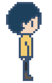
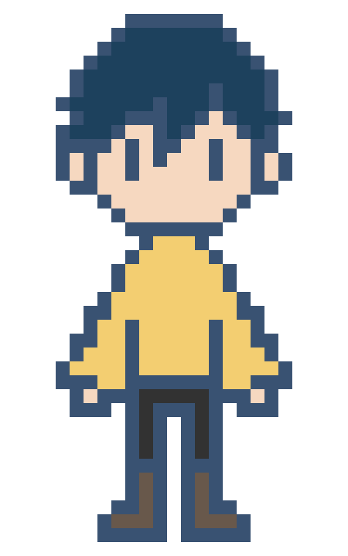
Left and right walk cycles for Atlas only needed to be 4 frames long each. The idle pose is acceptable as stationary, but having it move even just a little would make it feel more alive. Of course I still have to edit this sprite for the different skin colours and hairstyles - but this is a simple process when it is only a 4 frame animation. The walk cycle at 4 frames per second (FPS) compared to 8FPS is much more natural and fitting. Using 8FPS for a 4 frame animation looks like excessive speedwalking. I took the time to modify Atlas' hair on the left facing sprite to better match the character's left side profile. This extra detail also makes it less apparent to the audience that it is a horizontal flip. To turn the sprite frames into a sprite sheet, I can use an online resource that automates this process: https://ezgif.com/gif-to-sprite. This makes the process fast and easy, and accessible for the programmer. (Above) 2 frame classic bounce animation for being idle. Very easy to do but indefinitely gives the sprite more life. Avatar 2Since the design of Atlas both in comic and in sprite only change by hairstyle and skin colour - for the sake of simplicity in this project's production time - it was very straight forward to be able to use the first sprite as a template. In the original designs, the clothing and the front of the hair was the same, just to help maintain a consistency with the main character's identity. The original design for the second avatar was for it to be slightly more feminine, a mid skin tone, and to have a ponytail to the side. However, I decided to go more for a down version of the hairstyle for two reasons. Firstly, I realised that the ponytail was a little close to extending off of the canvas. While it is easy to make a canvas larger, it complicates the enlargement process. The sprite may have ended up the wrong size, and it was not worth the complications. If I was to draw these sprites from the beginning again, I would have used a canvas with more spare pixels around the initial design, so that experimenting and design isn't limited by space, and later complications can be avoided. Secondly, it isn't a common hairstyle for this age group of young girls, and they are more likely to simply wear their hair down. Avatar 3Avatar 3's description was to be darker in skin and have mid length hair, proposing more of an androgynous appearance. Sprite SheetsEarly pixel art trials of Atlas (before their final design had been decided) were very much experimenting with colour, line and the amount of pixels used for the character sprite. The first is very visually unappealing. There were not enough pixels for the face to have charm, and the face length was too pointy. Additionally, not having much definition for the outlines was not effective. The second experiment worked much better. Although there is a similar amount of pixels, the black lines really help the sprite to pop. The minimal detail (no mouth, big pixels) also works in communicating a very classic video game feel. It is only problematic in that with no room for eyebrows or a mouth, it is harder for any facial emotion to be present. While a sprite can communicate emotions through body language, it's still something I should consider. It should also be noted however that this sprite will be considerably small and details like this would probably not be possible to create successfully regardless. While I'm unsure if this is better for the purpose that it is to serve, the third version of Atlas definitely captures the spirit of the character the most. I'm unsure if it may be too detailed (too many pixels) for a very small sprite, but this also allows for more expression. If it is small, will it need such levels of expression, though? For the process of creating the final version of the Atlas sprite, I bought the popular (one time payment) pixel art application Aseprite and did some test versions to get a hang of the controls. However, with some experimenting I understood that I still prefer what I can achieve with Photoshop, and at this time at least, it is more efficient to use a program I already know how to use very well. This was another attempt at creating the final Atlas sprite. I worked in Photoshop this time, and it was definitely much faster and I was able to easily also use the official palette from the comic. I learnt that the black lines may be a little bit harsh, but an overlay filter on the lineart proved effective at softening the design while still having it be distinctive. I also had the idea of using noise to create a glitch transition when the sprite is generated into the game, but I'm going to leave experimenting with this animation concept until priorities are completed. This design was also the most adept at communicating a variety of facial expressions: While I think this sprite turned out really well, and would work for pixel illustration generally, when reduced back to it's original, smaller size, I realised it might be better to use a 'chibi' style design, more like some of the smaller sprites looked at in my research. As a stand alone, it would be acceptable, but considering I have to animate this sprite, and also alter its design for different character choices, it would be sensible to simplify the design. Here, I redesigned the previous sprite to be much more minimal. I have definitely been influenced the most by Omori's sprites and Pokemon's map version of sprites, as I felt that this stylisation is the most appealing for young children, since it is 'cute'. Drawing like this also allows for the sprite to really take Atlas' characteristics, while also being alike to my usual illustration 'style'. The blue tinted lineart is definitely still less harsh than the pure black and I will be using this going forward for the other frames of the sprite animation. The original size of the sprite image (25 pixels wide) is too small for its intended purpose. To upscale this sprite with accuracy, I compared possible sizes with the final dimensions of the comic illustration pages. The original sprite was created on a canvas only 25 pixels wide, but even upscaling to 100 pixels wide was extremely small. 200 pixels is a suitable size, but it aligned awkwardly with the borders of the comic. 180 pixels works out just right. This sizing is easily adjusted though, and may be revised later on when compared directly to the final images.
The first step of the process was to make sure my images are the correct resolution and size. Logan then had to scale the grid of the game engine to fit the canvas. Even though computers only view 72dpi, I am designing at a resolution of 300dpi, incase I need high resolution images to print for my portfolio later down the line. I cropped my scanned sketch of page 1 to the correct size: Logan had to experiment to find a scale that worked. On getting the scaling right, we realised that the original resolution of 1280 x 720 pixels was far smaller than expected, being only triple the size of the very small sprite. We experimented with how we could scale up the size of the image and have it be of a correct relative to the sprite size. I chose the x3 scale image size, for it would be less likely that the sprite would interfere with text/visual elements. To help with this further - we implimented a jump animation for the sprite, and Logan imported a stock sprite onto the page as it would sit in the final version, to be able to preview how this would work. You can see from the image below how this is very important. Above is the same preview, but on the x2 scale of the image. Using the x3 was definitely the better choice. This new resolution meant that all future images should be 3840 x 2160 pixels, at 300dpi. Logan was able to perfectly align the edge of the image with a 'floor' for the sprite. The 'floor' and 'walls' (vertical strips) will just appear as borders - but are necessary to make the page turning mechanic work. As the character hits the right, partially invisible 'wall', the character will move into the next 'room' - like a game. The next 'room' is the next page of the comic. Above is the final scale of the 'room' which functions in harmony with the size of the image and the sprite. Logan adjusted the camera to make the artwork central. This created black bars on the sides, but these can be changed to any colour. The decision of what to do with this will come when the comic has colour. The next things to be implimented were the jump, the avatar system and the music (sound effects were added early on). I trimmed and added fade effects to some suitable tracks (previously metioned in a #Sound blog post) so that they wouldn't sound so harsh as they loop during reading. I used Premiere Pro to do this.
Between Dreiton (by C418), Hidden Structure (by Leavv) and Lighthouse (by Leavv), I am unsure which to use. I will decide by listening to them while immersing myself in the comic when the prototype is completed. It is then that I can decide which one supports the intended atmosphere and matches the pacing of the events in the story the most. I also learnt how to make a a track muffled (for example, sounding underwater) - for potential use on selective pages or menus. I used a tutorial and Premiere Pro. Logan also informed me, regarding the buttons for switching avatars, that each button will need to be a .png of it's own and not within a larger image. This is simple going forward, as the buttons just need to be designed in their own layer, exported as a .png, and trimmed down to be without the entire canvas size. This applies for any interactive elements. (Above) The movement feature of jumping has been implimented and feels very light, in line with the comic's atmosphere. (Above) The avatar selection mechaninic through interacting with an element on the image is now active. This test sample uses pre-made sprites (one being Kirby.) When I come to animating my own pixel sprites, I have to export the frames as single images and make them into a 'sprite sheet'. This website will be useful for creating a sprite sheet: https://ezgif.com/gif-to-sprite. (Above) Logan also implimented a preview pane for the avatar selection. This can be moved anywhere and turned on or off. Using this feature will depend on the final layout of page 2, but I don't think it is particularly necessary in this project. If it adds visual impact I may find a way to use it. (Above) A definite test video of all of the implimented features so far: sprite running and jumping, avatar selection buttons, rooms, a platform, music, sound effects, and the artwork in the background. Additional Notes From This Process |
Pixel PlastersDevelopment compilation for Pixel Plasters. Archives
May 2022
Categories
All
|
|||||||||||||||||||||


