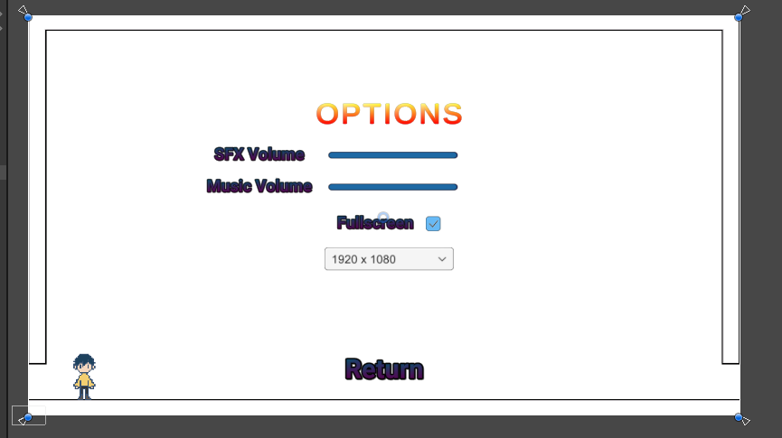
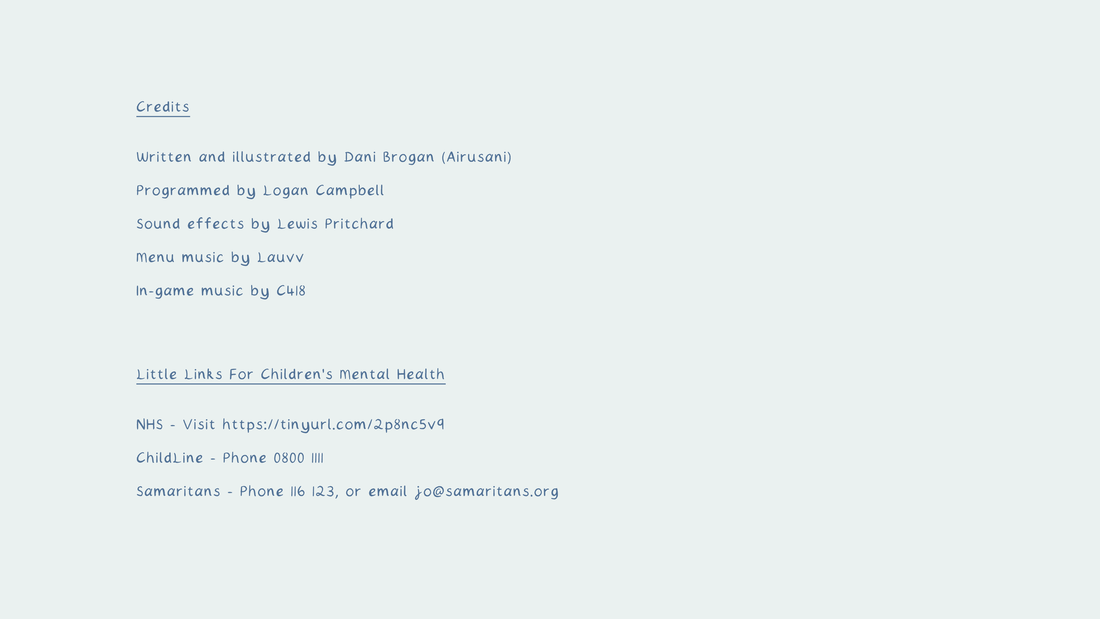
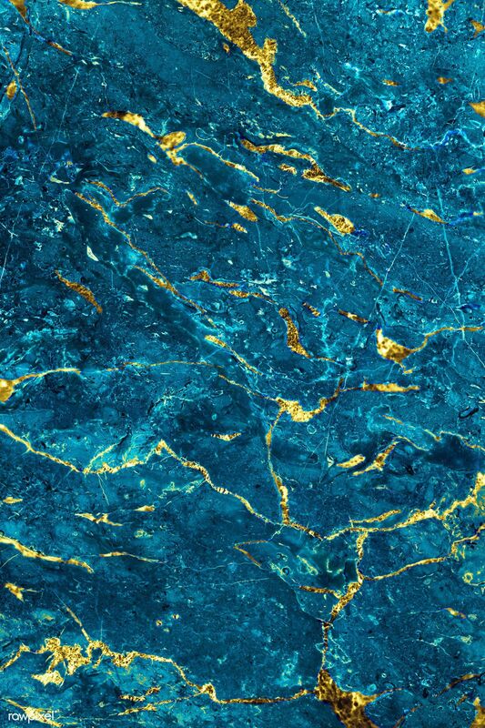
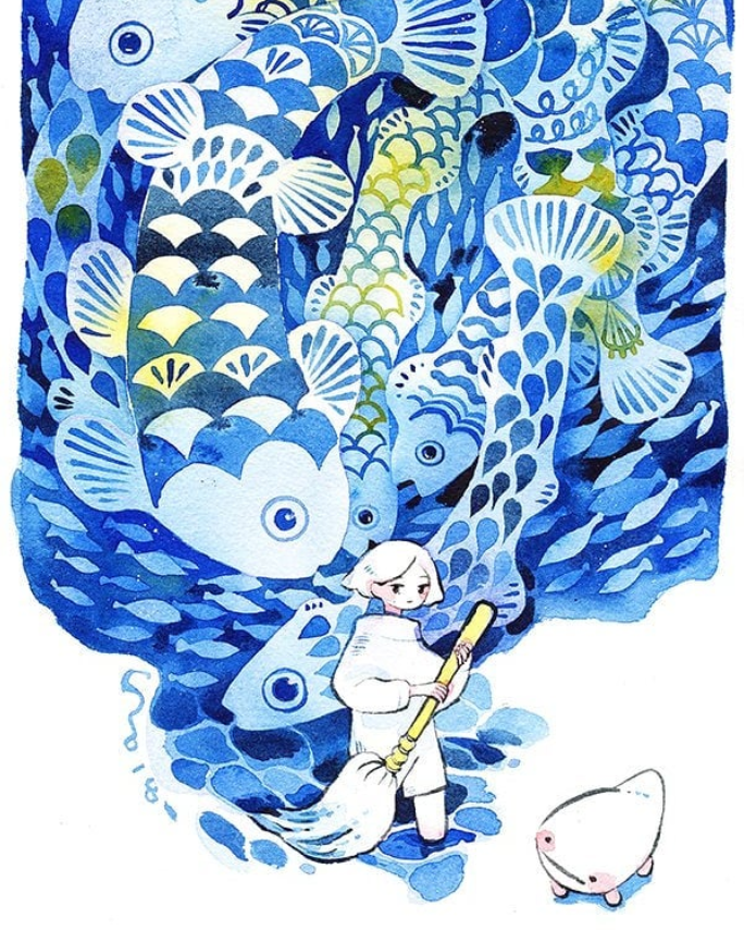
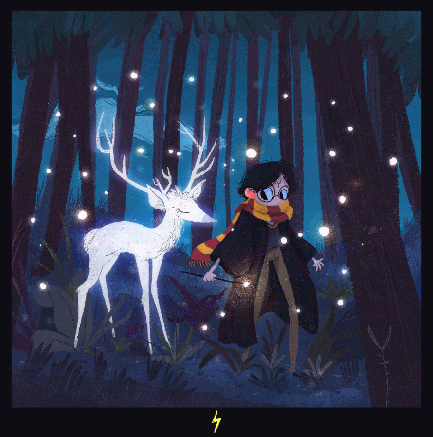
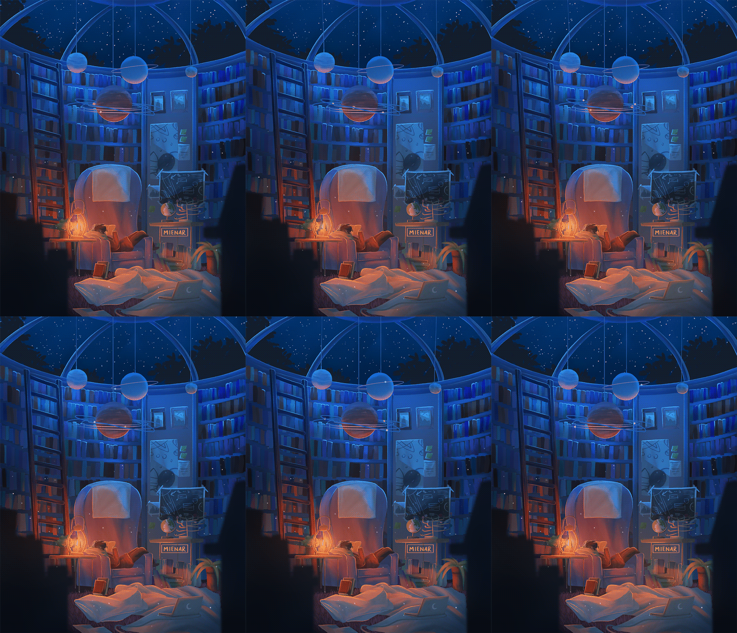
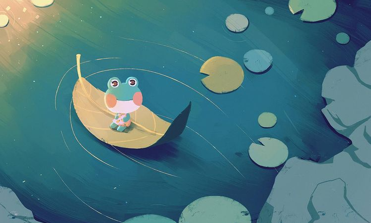
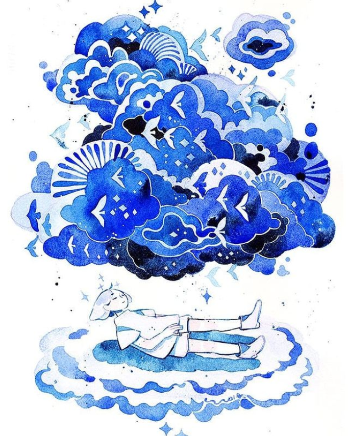
MenuThis illustration is based on a menu sketch from earlier in development. In the real world on the protagonist's blanket, their games console with Pixel Plasters running doubles as a menu screen. This suggests that you are about to go into this game in both the game world and the real world. References on the blanket are to life-simulation games that are known to help with mental health - while also being items that are (most) likely to be in a child of this age's bedroom. There is also a plush doll of secondary character Elio - who the protagonist meets later on in the story. This is a fun little implication that the protagonist became a fan of this game and bought this. Page 1The first page is focused on setting the scene. It is daybreak to symbolise the beginning of new things, and the fall of darkness; the world is calm and serene. I designed the panels in this very slow and steady manner to emphasise this. The panel progression also builds up to the last one, which reveals all of Cotton for the first time. As the first face we meet in the comic, this was important to make interesitng. I also drew him facing left when noticing something afar so physically he is guiding the reader to turn the page and find out what it is. The extended panel at the bottom is to take advantage of the comic format to show two moments in the same. It also provides a continuation of the prolonged moment in the opening page for the audience to understand what kind of place this is. Page 2Page 2 is the one that has the character switching button. It's the first illustration of Atlas, so it was important to have this artwork significantly larger than the other things happening on the page. The pacing on this page very steady and this is likely due to the conversation being very slow and not overly informational. I decided to spit the last panel into 3 seperate pieces, but not in a way that would mirror the top row. Having two halves of a triangle, and another panel with Atlas breaking the sense of boundarys, gives the visual impression that they are talking about a flashback. The two triangles making a whole panel help to make this clear - as well as the darkness indicating a different time of day. I broke the fourth wall in writing button instructions on Atlas' introduction panel, but I don't believe that it negatively affects the flow of reading. The buttons could very easily go unnoticed without including this text. I drew a cosmetic X button to give the impression that this window panel was a little bit different to the normal ones. Page 3Cotten helps Atlas up - in a sense of helping them to reach a better place, and this is the beginning of that. The rising sun also symbolises this newfound positivity and warmth. I tried to guide the reader's eye with the arrangement of the middle panels leading upwards to the final column. It is also to lightly convey the idea of the protagonist being pulled up with the panels themselves. I found trying to make a composition using Atlas themself between these panels was difficult to do, but leaves worked really well, and their simplicity compliments the busier illustration of the village that follows shortly. They show a progression of time and it makes sense that they can naturally move in this direction. It also connects to the next page, which also uses these leaves. In this page the leaves are helping Atlas reach a better place, but in the next page the breeze and leaves make them cold as they are slightly afraid of changing things. They are not only a symbol of passing time but in particular the moving journey of Atlas; Atlas' time. Page 4Cotton continues the warmth theme - giving his scarf to Atlas. Despite this love from a new person, I knew that I wished to convey the idea of Atlas being wrapped up in their feelings, and feeling suffocated by their flaws and emotions. They feel too lost to see what's right in front of them - but this is the first shift in facing these negativites head on. The page feels very cold in tone to represent this too. When considering the composition, I knew Cotton's warmth had to be the focus of the page. After this ,the location changes slightly, but instead of drawing walking, it was more important to visualise the conversation and emotions happening during this time. I think this allowed the pacing to feel like a little bit of time had passed since reaching the final panel, despite not many panels being in between. The small illustration of the general store depicts the place as very well kept and within a natural environment - somewhere that would be typically ideal for general mental healing. I guided the stone path out to the corner to lead the eye towards the next page. Page 5This page was very tricky to compose as it had a lot of information to share, a new character appearance and new character dynamics all on the same spread. I couldn't really spread this out to more pages in the time frame, so it took a lot of experimentation to make it work. I was finding difficulty in making the panels read in the right direction, and I continuously asked peers how they naturally read the comic - so that I could get a realistic taste of it's perception. I really like how it turned out but it took a lot of figuring out. For a page with a lot of things happening, it no longer looks too busy at all as it is very balanced out. I also had to spare a banter exchange between Elio and Cotton for the sake of guiding the reader in the right direction, but the latter is definitely the more important thing for the page. Page 6Elio takes Atlas out on their first delivery. I wanted to use less panels on this page so that the pace would slow down a little. I also intended for the panels to be less busy, for a contrast to the page that came before. This part of Atlas' journey is a slow and mindful one, where they are taking in their surroundings and beginning to adjust to change. I think the primary colours on this page work really well together in conveying a positive and bright mood - that of being offered a place to stay, having purpose, but also that of a place that Atlas recognises as beautiful and serene. I chose the pair to offer a delivery service instead of gardening (like in the original concept) after being inspired by the animation Violet Evergarden - a series that focuses on writing and delivering letters - making sure everyone receives the messages they need to hear. It was very much entwined on my mind how much this relates to the purpose of this comic and all the people that should be delievered its message. It was a very emotional series with a protagonist that suffered with mental health herself too from being a child-soldier. So while Elio and Atlas deliver goods, they are also delivering a message to the audience. It is also a common quest in video games to deliver things to others. In Stardew Valley, a mindful game in the research part of the project, you can accept such requests from the general shop's notice board. Similarly, in Animal Crossing, when starting at the town in many of the games, the general shop's owner will ask you to deliver products to town folk in an attempt to lightly push the player to make connections and learn about their new home. This is very closely linked to the ideas in the comic. The bedroom in the comic is also a reference to life simulation game Animal Crossing. Traditionally in the games you would always start out renting a house or a room from a Tanooki landlord - and the situation of the protagonist's whereabouts is a light parody of this in general. This one tiny room would come with only 4 items, always being a bed, a music player, a lamp of some kind, and a cardboard box. It's very fun to draw in references like this that still feel natural to the story. Page 7For this page of the comic, I was striving to depict Atlas as melancholic, so the tones of the page are very pale and dim. I also illustrated a plant losing a waterdrop to create an illusion of a tear droplet splash for that comic panel. Elio's positivity is divided by a cloud, as if to say this optimism is something Atlas dreams of having, but at this moment cannot obtain. The space around Elio is also suggesting the vastness of these "wonderful places." They may be far away, but who knows how many are out there? You'll only know by looking up, which Elio does in the last panel. I also shuffled the speech bubble placements to give a subconcious path of stepping stones which reach out into the bottom corner/next page turn, directing the eye. The cloud is also subtle foreshadowing of the next page containing a memory. Page 8This spread is half set in the real world, in a series of flashbacks projected by Atlas. The other half resumes the active happenings. I thought it was definitely important to contextualise the setting. This scene makes the reader aware that this is infact set in a video game for the most part - and it also gives a window to why Atlas feels the way they do. In composition, I wanted to seperate the sides for clarity. It is already considerably difficult to design horizontal spreads that read in a linear manner, so I decided to keep them apart. I used dark colours on the flashback half to reflect the emotions of the protagonist. I really like how the contrast came out, but I would improve on this page by experimenting with layouts even more so that I don't have to manually draw a line to help with clear reading. I added stars to the background of the flashback to relate to Atlas' darkness but also the light that comes from finding this gift. Celestial/space themes also push a narrative of these two worlds being far apart, but connected. Page 9This page is a small timeskip to future Atlas adapting to life in Wishleaf village and learning how to take care of themselves mentally. This self care is presented in polariods as to coinside with making good memories that will last forever. Polaroids themselves are similar as a frame to regular comic panels too, so I wished to take advantage of this. The page's composition is quite chaotic, and I would probably experiment with this layout more if I had more time. But the intent is that this is Atlas' wall/desk/etc. and it's a physical representation of all the things running through their mind and life. While the speech can be interpreted as being from Elio's customer, it also mirrors the way future Atlas feels. Page 10The newfound hope in the game is carrying out into the real world and affecting real-world Atlas. This is the meaning behind in-game Atlas emerging out of the screen and looking directly at the player. This world is real to them, and it's making them feel better in real life too. The line between their universes is mentally blurred. They are also in control of their own world, holding it gently in their hands and feeling the comfort of permanent warmth. As annotated on the original script too, the high smaller pannel on this page is to mirror page 2, the position in which Atlas is first seen. The illustration is flipped upside down, as is his expression - to show that the way Atlas feels has changed. It also connects their game-world and real-world selves in the same way the the key illustration on this page communicates this too. SystemThe original options screen was very bright and off-theme for the project's aesthetic, so I requested that the design could be minimalised. It was best to keep it looking calm and simple, and you can see that just by comparing menus. I also asked the programmer to download my custom font (.ttf) file so that the text could be uniform throughout the comic. For the credits page, I designed a simple image in Photoshop using the same colour theme and the text tool with my font. I considered adding illustrations to this screen, but I didn't want to make it too busy. Above is a preview of the final menu illustration being functional. I had to export all text as seperate buttons for this to work, and I sent Logan a template so placement on his end would be easier. ExtrasA last-thought touch that the programmer and I thought about for the project was creating a custom icon for the .exe program. While I could have designed something for this, I think a cropped version of Atlas' pixel self was the most perfect thing I could have used for this. It is still clear even when small, for that was it's intended size, and up close it is still visually interesting. Although this is a small thing that I have added, it adds a lot of professional flair to the game.
Elio is an important character in the story. He owns and runs the local shop, takes care of the gardens in the village, and mentors Atlas. Drawing Elio with thinner lines, and a more varied palette than Altas' initial artwork, made me realise I prefer this. I chose earthy colours for him, as he is a grounded individual.
Although Atlas is a much more sombre character than Elio - who is cool and chilled out, I felt the need to rework his design a little. I changed his palette from being somewhat 'muddy', to having more contrast. This will help him to stand out more against the sky, since the setting of the story is mostly outdoors. *For a better look: right click + select 'open image in new tab' Designing a colour palette that fits both the narrative and the audience.
Yellow Yellow promotes: Uplifting, cleansing, self-respect, self-confidence, self-control, ability to rationalise and reason, contentment, mentally stimulating Yellow is good for: Depression, despair, fatigue, negativity, sensitivity to criticism, lack of confidence (avoid in insomnia, hyperactivity) Gold promotes: Enthusiasm, balancing thoughts and feelings, wisdom Gold is good for: Depression (especially during menopause), stress, anxiety Orange promotes: Stimulates body and mind, self-esteem, optimism, inner strength, creativity, self-expression, happiness, opens mind to new ideas and perspectives, revitalising Orange is good for: Depression, negativity, trauma, stress, bereavement and loss Source "The colour yellow exudes brightness, light, vitality, energy, optimism, willingness to grow and outshine. Sun stars sunflower are the objects that most are associated with the colour yellow." Source "Yellow can be a bold color choice when it is bright, or soft and charming when it is pale. Using yellow is like offering an illumined beacon, or a single flame from a candle. In nature yellow reminds us not only of the luminosity of the sun, but also of brisk tasty lemons, chrysanthemums, and butterflies. The forecast yellow is soft with an “inner glow.”" Source Blue Blue promotes: Calm, peace, relaxation, slowing down, steadying, self-expression, intuition, honesty, truth, creativity Blue is good for: Insomnia, stress, anxiety, over-excitement, anger Turquoise promotes: Calm, cleansing, healing, personal relationships, sharing, friendship, resilience Turquoise is good for: Stress, anxiety, anger Source "Historically, blue is linked to positivity, harmony, spirituality, peace, calm, and tranquility. The most frequent blue associations occur in nature: Picture the placid surface of a blue lake undisturbed by the wind, or the rippling, impressionistic blue surface of the ocean. Of course, these visual impressions are also associated with acoustic elements. Evening waves, for example, can provide a deep soothing sound conducive to sleep. The color most beneficial in making people feel calm and relaxed is blue. In designing spaces for those with anxiety, a variety of blues ranging from the clarity of sky blue to the greened blue of turquoise can be utilized. Studies have shown that brighter colors: whites, light grays, and lighter colors, are found to be more pleasant, less arousing, and less dominance-inducing than less bright colors: dark grays, blacks, and darker colors. Creating color combinations within the context of traditional color associations is really the best approach. The forecast blue is deep and rich, a true blackened navy without a hint of gray. It combines well with the newly forecast pale, luminescent, slightly greened yellow, clear celery green, or a grayed, richly forested green." Source Green Green promotes: Balance, harmony, personal development, self-acceptance, compassion for self and others, renewal Green is good for: Stress, anxiety, self-pity, confusion Source "Green is one of various colors that can be beneficial to reduce anxiety and bring about a calmer state of mind. It has been said that green is the only color that is electromagnetically neutral. Historically emblematic greens are: the playful green on Sevres porcelain, Green Bay Packers’ jerseys, the abundance of jade greens, the olives of Italy and Greece with their sensual aromas and oils, mountain streams, and lily pads. Green is natural to forests both primeval and modern. Fresh grass is green, as are lively grasshoppers, frogs, and parrots. Many currencies use green as an identifying color. Of course, green is also the color of mold, slime, and aging copper. The context within which the color is used is essential to its implications. Exposure to the natural environment and natural light improves the well-being of patients. Greens are emblematic of new bud growth, new beginnings, and the strength of malachite and green granite. Views of nature also help patients focus on a world beyond their own problems and nemeses. A peaceful view of snow-capped mountain ranges sprinkled with fir trees can be beneficial to patients and caregivers alike." Source Pink "Pink is theoretically found in the red family, but retains primary implications of its own. Combined sensitively and appropriately it is very useful in healthcare to decrease aggression. The pale dusty pink of ballet slippers is soft and non-aggressive. It is a forecast color that meets the softness and energy we seek in our positive personal relationships. One study found that an anxiety producing story on pink paper was less anxiety producing than when read on blue or white paper. Able to be used as a natural floral accent to augment a completed interior, pink’s color range can run the gamut from fuchsia and orange-toned pinks to the whispered powdery pinks of makeup and chiffon." Source |
Pixel PlastersDevelopment compilation for Pixel Plasters. Archives
May 2022
Categories
All
|


