|
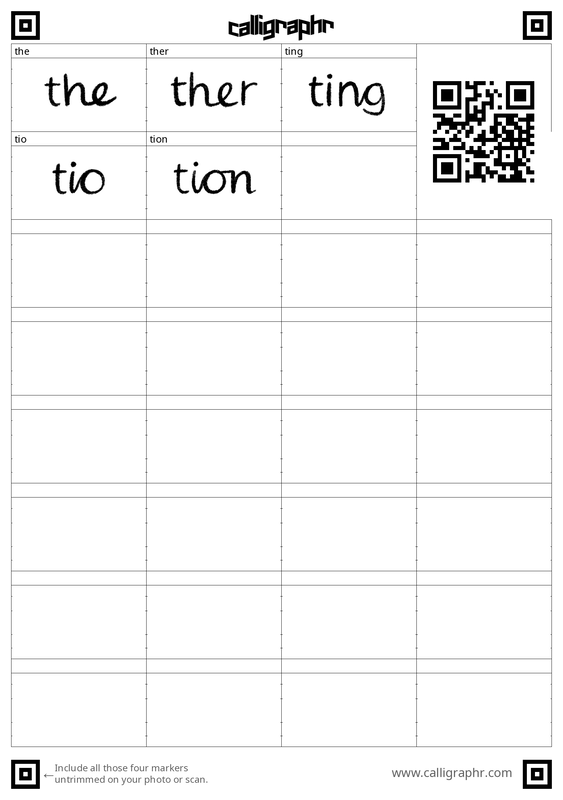
As mentioned in a talk-through recording, upon drawing the comic's roughs I realised that handwriting the text was definitely what I wanted to do, since it is gentle in quality, but also that over a span of many pages, it would be hard to keep the handwriting consistent in size and character. Thus, I looked for a way to create my own font. I still wanted to handwrite it. It would be imperfect as to keep the original quality, but surely more professional in appearance than if there was no font at all. Using a font also saves time in the respect that I can experiment more with editing dialogue, rather than having to go back and handwrite on the image again. Generally, it is also faster and cleaner. I followed a tutorial on how to use Procreate (my illustration medium of choice) and an app called Calligraphr to create a font. It offers a downloadable template, with which you draw over the faint letters in your own handwriting, and then upload the templates onto Calligraphr, choose some settings - and there you have a font of your own to download and install.
After uploading the templates, the previews for each character made me realise that the application did not respond well for dainty lines with small details. This caused my pencil crayon brush to appear sharp on the edges rather than soft. In big sizes this is problematic, but in smaller sizes this goes unnoticed, and the handwriting does not look harsh or sharp in that manner. I believe this to be fine for this comic since the text will never be a very big font size, but for future note I would not use this brush again. I used this brush for it is the same brush I used for illustrating the line art of my comic pages, and I wished for these to be the same.   (Above) The details picked up by the application compared to the real quality of my lines.   (Above) The text's appearance in medium and smaller sizes. It's pleasantly very much legible in both. However, I did tweek the kerning so that the characters would be closer together, and this indefinitely made the font feel more unified. I also removed the cursive ligatures because while they are natural to my handwriting, they negatively impacted the flow and overall appearance of the font. The baseline and size of the 'a' was also noticebly different to the other characters, so I adjusted this too.
Comments are closed.
|
|||||||


Site powered by Weebly. Managed by 34SP.com